

On most Shopify storefronts, mobile carries roughly 80% of sessions. Desktop, the remaining slice, typically converts at about 1.5x the mobile rate, with top-performing stores and higher-AOV catalogs pushing 2x or more. The traffic share and the revenue share rarely match.
Several brands have described the same pattern to us: they ran a single A/B test, segmented the results by device after the fact, and discovered mobile and desktop had moved in opposite directions on the exact same change. One device lifted, the other tanked, and the aggregate read sat somewhere lukewarm in the middle, close enough to "no significant change" to ship or kill almost arbitrarily.
When 90% of your traffic behaves nothing like the other 10%, the aggregate stops being a reliable unit of analysis. Most teams already sense this. The operational question that stays unsettled is whether end-of-test device segmentation is enough, or whether mobile and desktop need to be two independent tests from the start.
The answer turns on a few knowable factors. What follows is when one test with a device segment holds up, when you need two device-specific tests, and the patterns where device behavior diverges reliably enough that splitting should be the default.
The statistical problem with end-of-test device segmentation
Test design starts with a question, usually some version of "does this change move our primary conversion metric?" Sample-size calculators answer that question for the aggregate population. If you sized your test to detect a 3% lift across all sessions, the math assumes all those sessions count toward resolution.
That assumption breaks the moment you segment after the test ends.
A 90/10 mobile-desktop split means your desktop slice received about 10% of the sample you designed for. Reading a winner off that slice is reading noise. The test never had the volume on desktop to resolve real signal from the random variation any small sample carries. Anything significant-looking is more likely a false positive than a finding. Anything inconclusive tells you almost nothing, because the test was never going to be conclusive on desktop in the first place.
Then there's the aggregation problem. A change can win on aggregate while losing on desktop. Simpson's paradox applies cleanly when traffic mixes and conversion rates differ as dramatically as they do between devices. With a 90/10 split, anything that hurts desktop badly enough to matter at the revenue line can still get buried under the mobile result. The ship decision looks fine. The next quarter's desktop revenue does not.
Multiple comparisons compound the problem. Slicing the same test by device, by source, by new-vs-returning, by geography, each additional segment is another shot at a false positive. Treating each slice as a standalone read multiplies the noise.
None of which makes end-of-test segmentation useless. It is a good diagnostic, a sanity check that the aggregate result isn't being driven entirely by one device behaving wildly differently from the other. The broader case for treating segmentation as a primary lens on test results, not a secondary detail, applies here as much as it does for traffic source or visitor type. As a decision-making tool for device-specific shipping calls, it doesn't hold up.
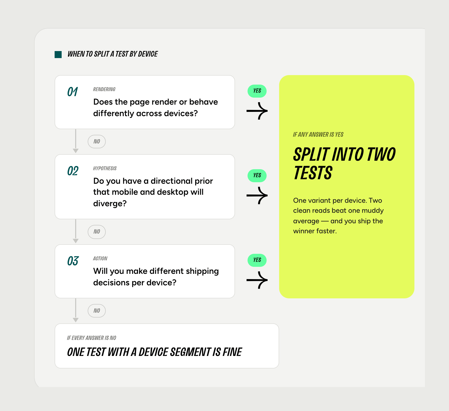
When one test with a device segment works
Splitting every test by device is overkill. Some changes don't warrant the operational cost of running two tests, and forcing the discipline everywhere slows velocity without improving decisions.
A single test with a segment guardrail works when:
- The change renders identically across viewports. A price test, a product title swap, a hero copy variation that looks the same on mobile and desktop. When the experience renders the same, device divergence is unlikely.
- You have no strong prior that mobile and desktop will move in opposite directions. Most copy-only changes fall here. So do most catalog-level changes (badges, ratings, social proof counts) when the rendering is consistent.
- You'd ship the aggregate winner regardless. If the decision is "did this work across our buyer base," and you'd act on the aggregate read either way, segmentation is just there to flag anomalies, not to drive a separate decision.
A simple heuristic: if you would be willing to ship the aggregate result without checking the device segment, one test is fine.
When mobile and desktop should be two tests from the start
Splitting becomes the right call when any of the following are true:
The change is device-specific by nature. Sticky mobile add-to-cart bars, mobile drawer navigation, desktop hover states, sticky desktop sidebars, mobile-only promotional banners. The element exists on one device and not the other, or behaves differently enough that lumping them into one test is testing two different things at once.
The change renders differently across viewports. Same code, different experience. A long-form benefit module that reads as a clean section on desktop becomes an endless scroll on mobile. A countdown timer placed beside the buy box on desktop overlaps the sticky cart on mobile. The "change" is not really one change.
You have a directional prior that devices will diverge. Urgency, copy length, image weight, form length: categories where mobile and desktop behaviors reliably pull in opposite directions. More on these below.
Desktop revenue is disproportionate to its session share. When desktop carries 25–40% of revenue on 10% of sessions (common on higher-AOV catalogs), desktop deserves a properly powered test on its own. Burying it inside an aggregate-led design treats it as a footnote when it is closer to a co-equal channel for revenue.
You want to make device-specific shipping decisions. "Ship to mobile, kill on desktop" is a reasonable outcome. A single aggregate-driven test cannot produce that decision with statistical confidence. Two tests can.
Patterns where device behavior diverges reliably
A short field guide. These are the categories where teams running aggregate-only tests get burned most often.
Urgency widgets. Countdown timers, low-stock indicators, scarcity messaging. On desktop, urgency tends to compete with other on-page elements for attention. On mobile, the same urgency can read as clutter. Every additional element fights for limited screen real estate. The same widget can lift desktop and suppress mobile, or the reverse depending on placement.
PDP copy length. Mobile users skim. Desktop users read. Long-form benefit copy and detailed feature breakdowns often win on desktop and lose on mobile, where they extend scroll depth and push the buy box further from the fold.
Mobile sticky add-to-cart. A mobile-only element by definition. Including it in an aggregate test means desktop sees no change while mobile carries the entire experimental load. The aggregate read is mathematically just the mobile read, diluted.
Hero image weight. Mobile cellular connections punish heavy hero media. Desktop tolerates it. A test that swaps a static hero for a looping video can win comfortably on desktop and lose on mobile through load-time effects alone.
Form length on checkout and quizzes. Mobile abandonment scales faster with field count. The cost of an additional input is higher on mobile than on desktop, sometimes substantially so.
Navigation density. Hamburger menus, exposed nav, mega-menus. The browse paths these enable look genuinely different on mobile and desktop, and tests that change navigation structure are rarely neutral across devices.
If your test touches any of these, the prior should be that devices will diverge. Default to splitting.
How the two designs compare in practice
Four mechanical differences separate "one test with a segment" from "two device-specific tests."
Traffic allocation. In a single test, traffic splits 50/50 between control and treatment at the aggregate level. With a 90/10 mobile-desktop mix, desktop ends up at roughly 5% control and 5% treatment. The desktop arm is dramatically underpowered before the test even starts. Two tests let you run desktop at 50/50 of its own (smaller) population, giving the desktop arm the best chance of resolution on its own terms.
Time to significance. Desktop-only tests run longer in calendar time because the population is smaller. They also actually resolve, instead of running indefinitely on a segment that never converges. Mobile-only tests typically reach significance faster than aggregate tests of equivalent design, and they let you iterate on mobile-specific patterns without dragging desktop into every cycle.
Hypothesis design. Splitting forces device-specific hypotheses. "Adding social proof above the buy box will lift add-to-cart on mobile by reducing risk friction in a low-information browsing environment" is a sharper hypothesis than "social proof above the buy box will lift add-to-cart." The discipline of writing a device-level hypothesis often surfaces that the change you were going to make was wrong for one of the devices anyway.
Reporting. Two independent reads are cleaner than one read with caveats. The conversation with leadership becomes "mobile lifted 4.2%, desktop was flat, we shipped on mobile," not "the aggregate was +1.1% but desktop looked like it might have moved the other way, we think."
A three-question decision framework
If you want to compress this whole post into a checklist for the next test you scope:
- Does the change render or behave differently across devices?→ Yes (split): sticky mobile CTAs, mobile hamburger nav, desktop hover states, mobile-only banners→ No (continue): price test, product title swap, badge color, trust signal copy
- Do you have a directional prior that mobile and desktop will move in opposite directions?→ Yes (split): countdown timers, long-form PDP copy, heavy hero media, longer forms, navigation density changes→ No (continue): updated badge text, supplier change copy, small visual tweaks
- Will you make different shipping decisions for mobile and desktop?→ Yes (split): "ship to mobile, kill on desktop" is an outcome you'd act on→ No (continue): you'll ship the aggregate winner regardless
Three nos: one test with a device segment is fine. Any yes: design as two tests from the start.
The diagnostic question worth carrying forward
Stop asking "did this win?" Start asking "did this win on the device whose behavior we were trying to change?"
The aggregate is a weighted average of two populations that, in many of the patterns above, do not behave like each other. Treating them as one obscures more than it reveals.
This is where Shoplift's design choices map cleanly onto the problem. Shoplift runs tests at the template level on Shopify, so a mobile-specific PDP template test and a desktop-specific PDP template test can be designed, scoped, and powered independently rather than stitched together as one aggregate experiment. Lift Assist surfaces device-level performance during the test rather than only at the end, so reversals between mobile and desktop become visible while the test is still running, not three weeks later when the end-of-test segmentation goes in. Device-segmented reporting is built into the platform, not bolted on.
Most teams already know aggregate-only reads are too coarse for a 90/10 traffic mix. The blocker is operational. Designing, running, and reporting on two parallel device tests is heavier work than running one. The leverage is in tooling that makes the two-test design as cheap to run as the one-test design.
When that operational tax drops to zero, splitting becomes the default.
FAQ
Should I run mobile and desktop A/B tests separately?
Run them separately when the change renders or behaves differently across devices, when you have a directional prior the two will diverge (urgency, copy length, hero weight, form length, navigation), or when you'd make different shipping decisions per device. A single test with end-of-test segmentation is acceptable when the change renders identically across viewports and you'd ship the aggregate winner regardless of the segment result.
What types of changes require separate mobile and desktop A/B tests?
Five categories are reliable triggers: urgency widgets (countdown timers, low-stock indicators), PDP copy length, hero image weight, form length on checkout and quizzes, and navigation density. Mobile sticky add-to-cart elements are mobile-only by definition. Any change that renders differently across viewports, even when the code is identical, should default to two tests. The underlying pattern: if the change touches screen real estate, attention model (skim vs read), bandwidth, or input method, devices will likely diverge.
Can you segment an A/B test by device after it ends?
You can, but treat the result as diagnostic, not decision-making. A 90/10 mobile-desktop split means your desktop segment received roughly 10% of the sample the test was designed for. That sample is underpowered and noise-prone. Use end-of-test segmentation to sanity-check that one device isn't driving the aggregate result anomalously. Don't use it to ship a device-specific change with confidence.
What if my A/B test wins on mobile but loses on desktop?
This is the scenario two device-specific tests are designed to surface clearly. If a single aggregate test segmented by device suggests this pattern, the result is suggestive but not conclusive. The desktop arm was almost certainly underpowered. The cleaner path is to rerun the change as two independent tests, one designed and powered for mobile, one designed and powered for desktop. If the pattern holds in properly powered tests, the right decision is usually device-specific shipping: ship to mobile, keep desktop on control. A single aggregate "no significant change" result is not the same answer as "winning on one device, losing on the other."
Why do mobile and desktop convert differently on the same change?
Screen real estate, attention models (skim vs read), bandwidth, input method (touch vs cursor), and session intent all differ across devices. The same urgency widget, copy block, or image asset lands in a different context on each device. That context determines whether the change adds friction or reduces it. The answer often points in opposite directions on each device.
Why is desktop traffic underpowered in aggregate Shopify A/B tests?
Most Shopify storefronts have roughly an 80/20 mobile-desktop traffic split. When an aggregate A/B test runs at the default 50/50 control-treatment allocation, desktop ends up at roughly 10% of total traffic per arm. Sample-size calculators that sized the test for aggregate detection assumed all sessions counted toward resolution. They didn't account for the desktop slice being only 20% of the sample. The desktop arm runs at half the per-arm volume of mobile, which means most aggregate tests resolve clearly for mobile and remain underpowered for desktop regardless of how long the test runs.
How much traffic do you need to A/B test mobile and desktop separately on Shopify?
The mobile arm rarely needs additional traffic. Most Shopify stores already have enough mobile volume to power independent mobile tests. The desktop arm is where teams hit the ceiling, and the answer depends on baseline conversion rate and detectable effect size. A useful sanity check: if your desktop segment in past aggregate tests never reached significance on its own, your desktop-only test needs a larger detectable effect, a longer runtime, or both.
Should I test mobile or desktop first when running device-specific A/B tests?
Test mobile first when the change is a mobile-specific element (sticky add-to-cart, mobile nav drawer, mobile-only promotional banner) or when mobile carries enough revenue that waiting for desktop results doesn't justify the delay. Test desktop first when desktop carries disproportionate revenue (common on higher-AOV catalogs) or when the change is desktop-specific (hover states, sticky sidebars, wider hero formats). If neither applies, mobile usually goes first because the higher session volume means faster resolution and faster iteration.
What is Simpson's paradox in A/B testing?
Simpson's paradox is when a result that holds at the aggregate level reverses or disappears once the data is broken into subgroups. In A/B testing, the most common version is a test that appears to win on aggregate but loses when you segment by device, traffic source, or visitor type. It happens when subgroups have very different conversion rates and very different proportions of traffic, exactly the conditions an 80/20 mobile-desktop split creates. The aggregate result becomes a weighted average that hides the divergence underneath.
What is device segmentation in A/B testing?
Device segmentation is the practice of analyzing test results separately for mobile and desktop populations rather than reading only the aggregate. It can be done two ways: as an end-of-test analysis, by segmenting one test's results after the fact, or by design, by running mobile and desktop as two independent tests. The two approaches answer different questions and have very different statistical properties.
