
Why Your Mobile Navigation Is Costing You Sales (And How to Fix It)
We spend a lot of time thinking about checkout optimization, landing page design, and ad creative. But there's one element that touches 99.99% of your store visitors that rarely gets the attention it deserves: navigation.
Your navigation is the roadmap shoppers use to explore your store. When it's unclear, cluttered, or poorly organized, you're creating unnecessary friction at the very start of the customer journey. This consistently results in higher bounce rates, lower conversion rates, and missed opportunities to increase AOV.
According to Baymard Institute research, 76% of ecommerce sites fail navigation usability tests. That's not a small problem. It's a widespread issue that's quietly draining revenue from stores across the industry. Our friends at Platter, a Shopify Plus agency that's worked on 150+ storefronts, confirm this finding. Navigation is almost always among the first friction points they identify in store audits.
The stakes are even higher on mobile, where screen real estate is limited and shoppers are often browsing in distraction-filled environments. A confusing navigation experience on mobile doesn't just frustrate users; it actively pushes them toward the back button.
So how do you turn your navigation from a conversion killer into a conversion driver? Cam Wind, Product Marketing Manager at Platter, recently shared four tactical ways to optimize your mobile nav. Let's break them down.
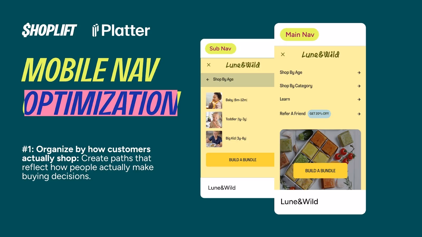
1. Organize by how customers actually shop
Here's a common mistake: organizing your navigation around your internal product categories. It makes sense from an operational perspective, but it creates cognitive friction for shoppers who don't think about your products the way you do.
Instead, organize your nav around how customers actually make buying decisions. What problems are they trying to solve? What occasions are they shopping for? What goals do they have in mind?
The example: Lune & Wild
Lune & Wild, a brand that sells organic baby and toddler food, uses "Shop by Age" as their top-level navigation category. This approach works because it mirrors exactly how parents think about feeding their kids. A parent with an 8-month-old isn't thinking "I need purees from the vegetables category." They're thinking "What can my 8-month-old eat?"
By organizing navigation around the customer's mental model, Lune & Wild reduces cognitive load and helps shoppers find the right products faster. Fewer clicks, less confusion, and a smoother path to purchase.
How to apply this
Start by interviewing customers or analyzing support tickets to understand how they describe their needs. Look for patterns in the language they use and the problems they're trying to solve. Then map your navigation to those patterns.
Some effective customer-centric navigation frameworks include Shop by Use Case (workout, travel, everyday), Shop by Goal (build muscle, lose weight, improve sleep), Shop by Occasion (gifts, special events, seasonal), or Shop by Problem Solved (sensitive skin, dry hair, acne-prone).
The best navigation structure depends on your specific product category and customer base, but the principle remains the same: organize around the customer's perspective, not yours.
2. Separate shopping and learning paths
Not every visitor is ready to buy. Some are still researching, comparing options, or trying to understand if your product is right for them. If education is part of your sales funnel, don't force these shoppers to wade through product pages to find the information they need.
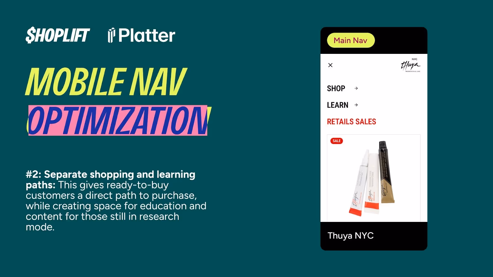
Create two distinct paths in your navigation: one for shoppers ready to buy, and one for those who need to learn first.
The example: Thuya NYC
Thuya NYC, a brand focused on natural nail care products, makes a clear distinction between "Shop" and "Learn" in their navigation. The Shop path takes customers directly to products, collections, and bundles. The Learn path provides educational content, tutorials, ingredient information, and brand story.
This separation serves both customer segments effectively. Ready-to-buy customers get a frictionless path to purchase without being slowed down by content they don't need. Research-mode customers get the information they're looking for without feeling pressured to buy before they're ready.
Why this matters
When you mix shopping and learning in your navigation, you create confusion. Customers in research mode might bounce because they can't find the information they need. Customers ready to buy might get distracted by content and lose purchase momentum.
Clear separation respects where each customer is in their journey and guides them appropriately. It also gives you better data about customer intent, since you can track which path visitors choose first. If your product requires education, consider a dedicated "Learn" or "Resources" section separate from product categories, with clear calls-to-action that help customers transition from learning to shopping when they're ready.
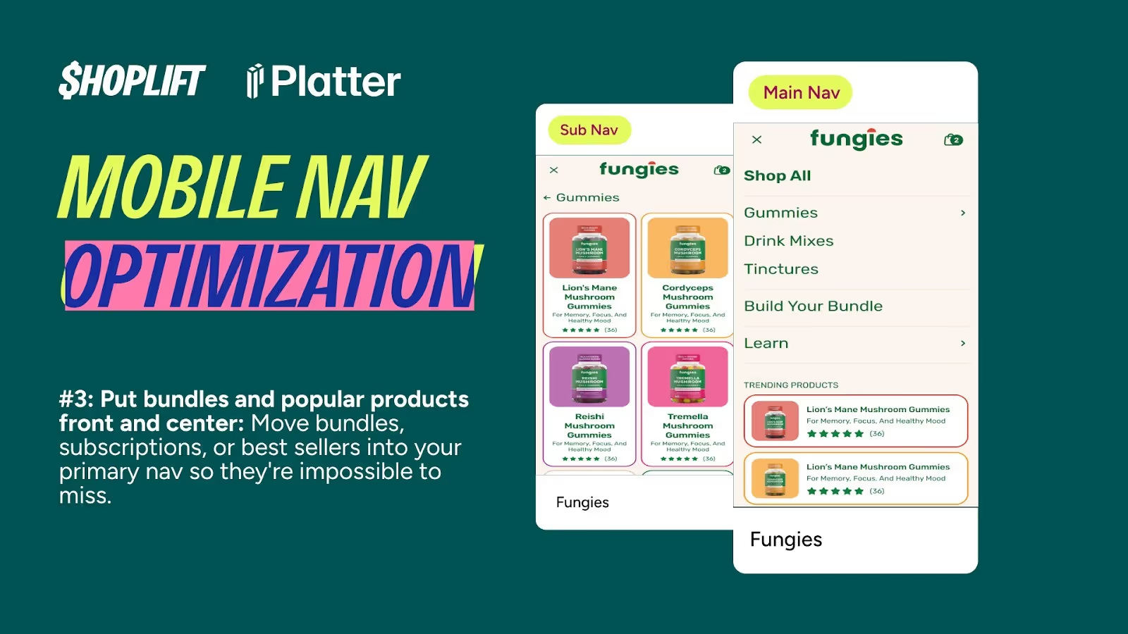
3. Put bundles and popular products front and center
Your navigation should prioritize your most strategic business outcomes. If bundles drive higher AOV, if subscriptions improve LTV, or if certain products have the best margins, those offerings should be prominently featured in your navigation.
Too many stores bury their most profitable flows deep in category hierarchies. That's a missed opportunity. Your primary navigation is prime real estate. Use it strategically.
The example: Fungies
Fungies, a functional mushroom supplement brand, puts "Build Your Bundle" directly in their primary navigation. They also feature "Trending Products" to nudge customers toward their most popular items.
This strategic placement serves multiple goals. It increases bundle adoption, which boosts AOV. It reduces decision paralysis by highlighting popular choices. It guides first-time visitors toward products with strong social proof. And it distributes traffic more strategically across the catalog.
By making bundles and trending products visible from the nav, Fungies ensures that every visitor sees these high-value options, regardless of which page they land on.
What to promote
Consider featuring bundles and kits (these typically drive higher AOV), best sellers (social proof reduces purchase anxiety), subscriptions (if core to your business model), new arrivals (keeps your store feeling fresh), or sale items (clear visibility drives urgency).
The specific mix depends on your business priorities, but the principle is universal: don't make customers hunt for your most strategic offerings. Be selective though. Don't try to promote everything. Choose the 2-3 most important pathways and give them prominent placement. On mobile especially, where space is limited, this selectivity is crucial.
4. Make your navigation instantly scannable
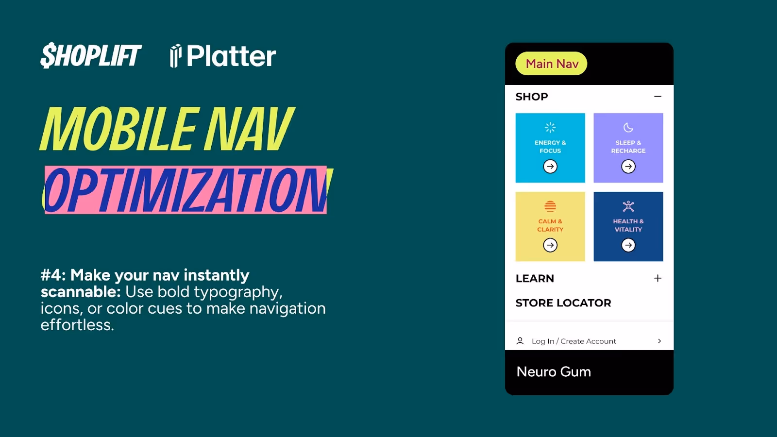
Mobile navigation often requires clicking through nested menus. Shoppers can't see all their options at once, so clarity becomes even more important. Every menu item needs to communicate its contents clearly and immediately.
Visual design plays a crucial role here. Typography, icons, color, and spacing all contribute to how quickly shoppers can parse their options and make decisions.
The example: Neuro Gum
Neuro Gum uses bright colors and large, clear icons in their navigation. Each category is visually distinct, making it easy to scan and understand at a glance. Shoppers immediately know what they're looking at and where each click will take them.
This approach works because it reduces the cognitive effort required to navigate. Instead of reading and processing text, shoppers can quickly scan for visual cues. The result is faster navigation, less frustration, and fewer abandoned sessions.
Design principles to follow
Use clear, descriptive labels. Avoid clever or vague category names. "Workout Supplements" is clearer than "Fuel Your Fire." Clarity always wins over creativity in navigation.
Leverage visual hierarchy with size, weight, and color to show the relative importance of navigation items. Consider icons strategically, but only if they're immediately understandable. Test with real users to ensure icons communicate what you think they do.
Optimize for thumb reach by placing your most important navigation elements in the easy-to-reach zone. The bottom and center of the screen are easier to tap than the top corners. And always test with real devices. Navigation that looks great on a desktop browser can feel cramped or unclear on actual mobile devices.
Small changes, big impact
Navigation might not feel as urgent as fixing checkout or optimizing landing pages, but it influences almost every shopper who lands on your store. Small changes—like the ones Cam shared—add up to measurable improvements in conversion rate, lower bounce rates, and even higher AOV.
Navigation optimization is powerful because it impacts every single visitor to your store. Unlike landing page optimization (which only affects traffic from specific sources) or checkout optimization (which only affects shoppers who make it that far), navigation touches everyone. A 5% reduction in bounce rate from better navigation could translate to thousands of additional shoppers entering your funnel each month.
The four fixes Cam shared—organizing by customer thinking, separating shopping and learning paths, promoting high-value offerings, and improving scannability—are all relatively straightforward to implement. Start with one change, test it with Shoplift to measure the impact, then move on to the next. Over time, these improvements compound into a navigation experience that actively helps shoppers find what they need and moves them smoothly toward purchase.
Your navigation should work for you, not against you. With a few strategic changes, you can turn it into one of your most effective conversion tools.
At Platter, the team has worked on 150+ Shopify storefronts, and navigation is almost always one of the first friction points they fix. For Shoplift readers, they're offering a free store audit. They'll go beyond your nav to highlight practical changes that can improve conversion, AOV, and overall profitability.
Get your free audit from Platter
Subscribe to the Shoplift newsletter
Get insights like these emailed to you bi-weekly!
{{hubspot-form}}
